Y'all can now stop asking about when we're going to update our dashboard—it's here! Go log in right now to see the new design in action.
The "When are you going to update your dashboard?" question has been bugging us for a while. Not because it's a poor question—it's a great question, in fact—but because completely revamping the dashboard experience is no easy task. We contend with dozens of moving parts, thousands of lines of code, and the hopes that we're going to make our users happy.
So, over the last few months, we've been improving the look, feel, and functionality of the SSD Nodes dashboard. We took our time, but we're finally ready to share our progress and talk about what's coming next.
The new experience
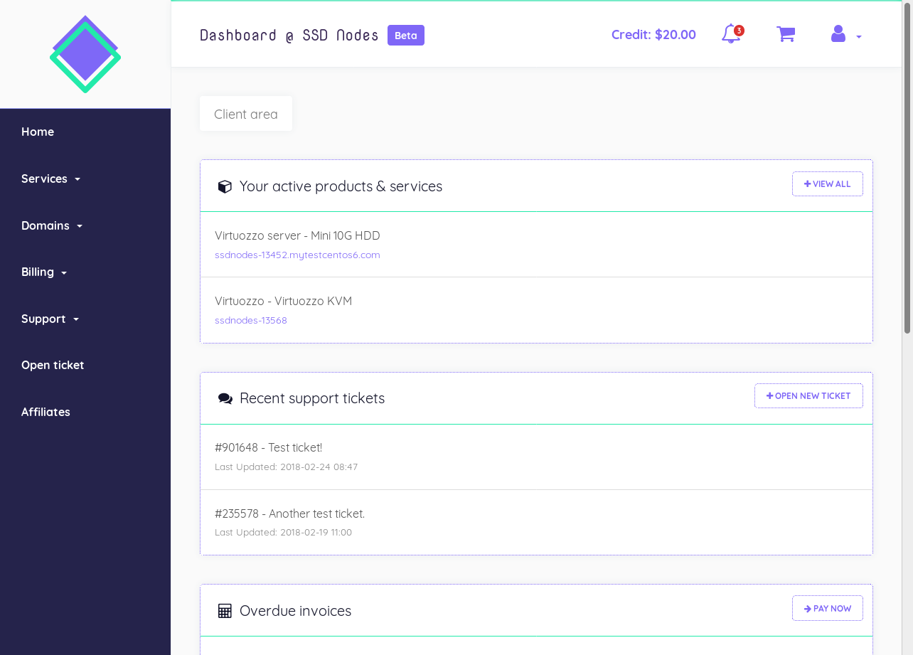
You can log in to see the new dashboard right now, or check out the screenshot below.

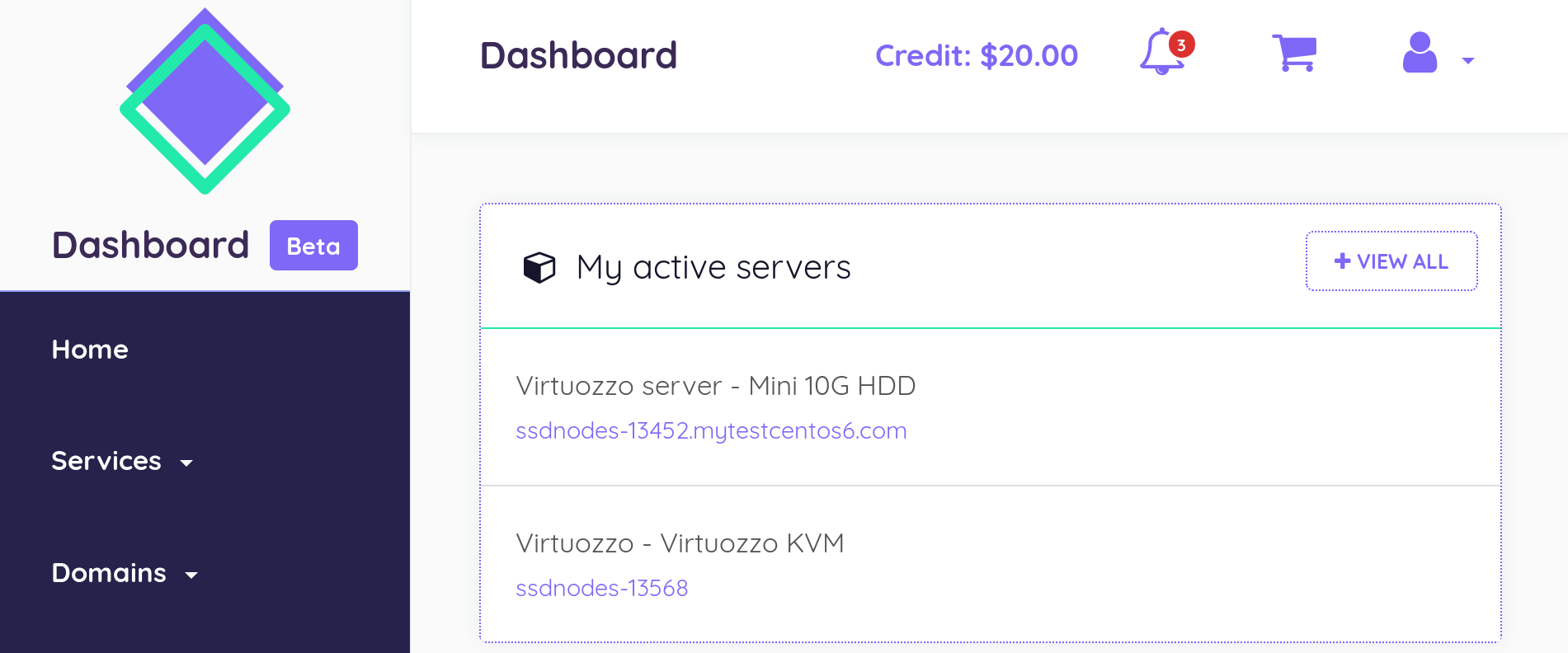
Here we see a pretty typical SSD Nodes user: a few active servers, a handful of support tickets, some SSD Nodes credit, and active notifications.
In previous incarnations of the dashboard, active servers and support tickets were buried behind vague numbers. Other critical areas were hidden behind multiple clicks on drop-down menus. There was no way to see if you have any SSD Nodes credit at a glance, and, overall, a cluttered design made finding information difficult.
Now, we've been able to unclutter the experience while also making it easier to find what you need.
That's why delivering the information you need in as
by subscribing to our newsletter.


